Small text is one of the most challenging elements to reproduce in embroidery. Unlike printed lettering, embroidered text is created with stitches, and every letter must have enough space and structure to remain readable after stitching. Embroidery Digitizing Services use specialized techniques to convert small lettering into stitch designs that balance readability, durability, and visual quality.
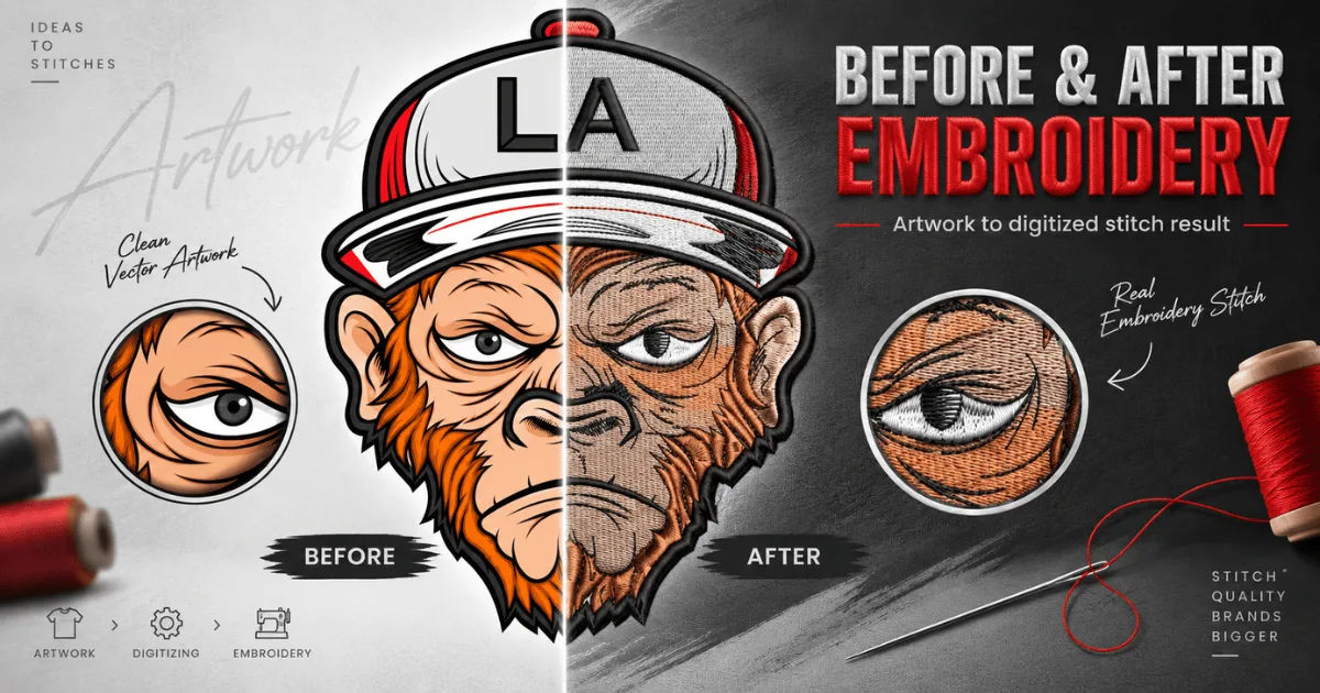
The challenge becomes greater when text is placed on caps, shirt pockets, uniforms, patches, or other limited spaces. A font that looks clear on a computer screen may become difficult to read once converted into thread. Professional digitizers therefore consider font style, letter height, stitch density, fabric type, thread thickness, and machine settings before finalizing a design.
This guide explains how small text is prepared for embroidery, what problems can occur, which techniques improve readability, and how businesses can get better results from their embroidery projects.
Why Is Small Text Difficult to Embroider?
Embroidery has physical limitations that do not affect digital or printed text. A tiny letter may contain several curves, corners, and narrow spaces. When these details are represented with stitches, they can merge together.
For example, the openings inside letters such as “e,” “a,” “o,” and “P” can disappear when the lettering becomes too small. Thin lines may also become weak or break visually when stitched onto fabric.
Professional Embroidery Digitizing Services understand these limitations and adjust the artwork rather than simply reducing its size.
Stitch Size Matters
Each stitch has a practical minimum length. Extremely short stitches can create unnecessary bulk and may not form cleanly during machine embroidery.
If a small letter contains too many tiny stitches, the needle may repeatedly enter nearly the same area. This can cause thread buildup, puckering, or an unclear appearance.
Digitizers modify stitch placement so the smallest details can be produced reliably.
Thread Is Thicker Than Digital Lines
A digital font can contain extremely thin lines. Embroidery thread, however, has physical thickness.
When two thin lines are positioned close together, the thread can cause them to visually touch. This is why a font that appears perfect in artwork software may require significant modification before embroidery.
How Do Embroidery Digitizing Services Prepare Small Text?
Creating successful small lettering is not simply a matter of choosing a smaller font. The lettering must be redesigned for embroidery conditions.
Professional Embroidery Digitizing Services normally examine the entire design before deciding how the lettering should be stitched.
Selecting an Appropriate Font
Font selection is one of the first considerations.
Simple fonts generally perform better at small sizes because their letter structures are easier to reproduce with stitches. Clean sans-serif fonts are often easier to read than highly decorative scripts.
Fonts with excessive ornamentation can become confusing when reduced. Fine serifs, narrow spaces, and complicated curves may disappear.
Adjusting Letter Height
There is no single minimum size that works for every font and fabric.
Some simple lettering can remain readable at relatively small heights, while complicated fonts need more space. The final size also depends on whether the lettering is being placed on a smooth shirt, thick jacket, cap, or textured material.
Experienced digitizers evaluate the actual stitch result rather than relying only on the dimensions displayed on screen.
Simplifying Letter Shapes
Small embroidery often requires controlled simplification.
A digitizer may remove tiny decorative features, widen narrow sections, or slightly modify curves. These changes may make the digital artwork look different from the original font, but they can significantly improve the final embroidered result.
The goal is not to preserve every microscopic detail. The goal is to preserve the identity and readability of the lettering.
What Stitch Types Are Used for Small Text?
Different stitch types create different results. Choosing the correct stitch structure is especially important when working with small letters.
Satin Stitches
Satin stitches are commonly used for lettering because they can create smooth, clean columns.
They work particularly well when letter strokes are wide enough to support them. However, extremely narrow satin columns can become unstable or produce inconsistent results.
Digitizers carefully control the width and direction of satin stitches when creating small lettering.
Running Stitches
Running stitches can be useful for extremely fine details.
Instead of creating a wide stitched column, the digitizer uses a narrow line of stitching. This can help represent tiny text, although readability may be lower than with larger satin-stitched letters.
Running stitches are often considered when the lettering is too small for conventional satin construction.
Fill Stitches
Fill stitches are generally more suitable for larger areas than very small text. Using fills on tiny letters can create excessive density.
A skilled digitizer determines whether a letter should use satin, running, or another stitch structure based on its size and shape.
How Stitch Density Affects Small Lettering
Stitch density describes how closely stitches are positioned.
It might seem logical to use more stitches to make small text clearer. In reality, excessive density can make the design worse.
When too many stitches occupy a small area, thread can accumulate. The letters may become stiff, raised, or visually crowded.
Professional Embroidery Digitizing Services control density according to the fabric, thread, lettering size, and stitch type.
Avoiding Excessive Thread Buildup
Thread buildup is a major concern with small text.
If every detail receives heavy stitching, neighboring areas can merge. This is particularly problematic with letters containing small counters and openings.
Reducing unnecessary stitches helps maintain separation between different parts of each letter.
Maintaining Consistent Coverage
At the same time, density cannot be reduced too much.
If there are not enough stitches, the fabric may show through the lettering. The result can look weak or incomplete.
Good digitizing finds the middle ground between sufficient coverage and excessive thread.
How Does Fabric Affect Small Embroidery Text?
The same lettering design can produce different results on different materials.
A smooth cotton shirt may respond differently from fleece, denim, canvas, or a structured cap. Fabric movement can affect stitch placement and letter edges.
Stretchy Fabrics
Stretch fabrics can make small text more difficult.
When the material moves during stitching, tiny letters may lose their shape. Stabilizers are often important because they help support the fabric during embroidery.
Thick Materials
Heavy fabrics may support embroidery well, but they can also affect how stitches sit on the surface.
Digitizers may adjust stitch density, underlay, and other settings to account for the material.
Caps
Caps present another challenge because of their curved surfaces.
Small lettering on the front of a cap needs careful stitch planning. The digitizer must consider the direction of stitching and the movement of the cap through the embroidery machine.
What Is Underlay, and Why Is It Important?
Underlay consists of supporting stitches placed underneath the visible stitches.
For small text, the wrong underlay can cause problems. Too much underlay can increase thickness and interfere with tiny letter shapes. Too little support can allow the fabric to move and distort the lettering.
Embroidery Digitizing Services choose underlay based on the material and design rather than applying one setting to every project.
The objective is to stabilize the fabric without making the small lettering unnecessarily bulky.
How Do Digitizers Improve Letter Spacing?
Spacing is critical when text is small.
Letters that look comfortably separated on a computer may appear connected after stitching. Thread expands slightly and can occupy more visual space than the original digital artwork suggests.
Adjusting Kerning
Kerning refers to the spacing between individual letters.
Professional digitizers may adjust spacing manually. This is particularly useful when certain letter combinations naturally appear crowded.
For example, letters with angled shapes may need different spacing from letters with straight vertical strokes.
Preserving Word Readability
Small lettering should be evaluated as complete words rather than individual letters.
Even if every character looks acceptable separately, the word may become difficult to recognize if the spacing is inconsistent.
The digitizer therefore considers the overall visual balance of the text.
Does Thread Color Matter?
Thread color can influence readability.
Strong contrast between the lettering and the fabric usually makes small text easier to recognize. Low-contrast combinations may cause fine details to disappear visually.
For example, dark thread on a dark fabric can make already-small letters difficult to distinguish.
Color is especially important when a design contains multiple lines of small text. Each line needs enough visual contrast to remain separate.
How Do Embroidery Digitizing Services Test Small Text?
Testing is an important part of professional digitizing.
A design may look excellent in embroidery software but behave differently on an actual machine. For that reason, Embroidery Digitizing Services often evaluate stitch simulations and, when necessary, create physical samples.
Reviewing the Stitch Simulation
A stitch simulation shows the sequence and structure of the embroidery.
It can reveal excessive density, awkward stitch directions, unnecessary jumps, and other potential problems before production.
However, a simulation does not always predict the exact appearance of physical embroidery.
Creating a Sample
A physical sample provides a much better indication of how small text will look.
The sample should ideally be stitched on the same or similar fabric that will be used for the final product.
This allows the digitizer to identify problems with readability, spacing, density, and stabilization.
What Happens When Text Is Too Small?
Sometimes the requested lettering is simply below a practical embroidery size.
In that situation, making the text smaller is not the best solution. The letters may become unreadable regardless of how carefully they are digitized.
A professional digitizer may recommend increasing the letter height, selecting a simpler font, reducing the amount of text, or changing the placement.
These changes can preserve the message while improving the finished product.
When Simplification Is Better Than Shrinking
Suppose a company wants a long slogan embroidered beneath a logo. Trying to fit the entire slogan into a very narrow space may produce tiny, crowded lettering.
A better approach could be shortening the wording or moving the text to another area.
Good digitizing is partly about knowing when the original artwork needs practical modification.
Common Problems With Small Embroidered Text
Understanding common problems can help customers set realistic expectations.
Letters Become Blurred
Blurring often occurs when stitches overlap or when the lettering is too small for the selected font.
Simplifying the letter structure and adjusting stitch density can help.
Letter Openings Disappear
The interior spaces of small letters can close because of thread thickness.
Increasing spacing or slightly opening the letter structure can improve clarity.
Text Looks Too Heavy
Excessive density can make letters look thick and crowded.
Reducing unnecessary stitches and selecting an appropriate stitch type can produce a cleaner result.
Text Looks Too Thin
The opposite problem can also occur.
If the lettering lacks enough coverage, the fabric may dominate the design. Appropriate stitch width and density can provide stronger visual definition.
How Can Customers Prepare Artwork for Small Text?
Customers can make the digitizing process easier by providing clear artwork and realistic expectations.
High-quality source artwork helps the digitizer understand the intended font, proportions, and layout.
It is also useful to explain where the design will be embroidered and what type of garment or material will be used.
A logo intended for a shirt may require different treatment from the same logo intended for a cap.
Why Professional Digitizing Makes a Difference
Automatic conversion tools can produce a basic stitch file, but small text often requires human judgment.
A professional digitizer understands how stitch direction, density, spacing, underlay, fabric behavior, and thread thickness interact.
Embroidery Digitizing Services can manually adjust problematic letters and create a design that is better suited to actual embroidery production.
This is especially valuable for company names, uniforms, labels, logos, product branding, and other applications where readability matters.
Best Practices for Small Embroidery Text
Several principles consistently help produce better results.
Use simple and readable fonts whenever possible. Avoid unnecessary decorative details at very small sizes.
Choose an appropriate letter height instead of forcing text into an extremely small space.
Maintain enough spacing between letters and words so thread does not visually merge them.
Adjust stitch density according to the material and size of the lettering.
Use suitable stabilizers to reduce fabric movement.
Test the design before beginning large-scale production.
Most importantly, evaluate the actual embroidered sample instead of judging the design only from a computer preview.
When Should Small Text Be Replaced With Printing?
Embroidery is not always the ideal method for very small lettering.
If text must be extremely tiny, contain intricate details, or fit into a very limited space, printing may provide better clarity.
The right choice depends on the purpose of the garment, the desired appearance, durability requirements, and production method.
For larger small-text applications where embroidery is appropriate, careful digitizing can still produce excellent results.
Conclusion
Small text requires considerably more planning than simply reducing a font size. Embroidery transforms digital artwork into physical stitches, so every letter must be designed around the limitations of thread, needles, fabric, and embroidery machines.
Professional Embroidery Digitizing Services handle small text by selecting suitable fonts, simplifying complicated shapes, controlling stitch density, adjusting spacing, choosing appropriate stitch types, and considering the characteristics of the fabric. They may also use underlay and stabilization techniques to prevent distortion.
Testing is equally important. A stitch simulation can identify many technical issues, while a physical sample shows how the lettering actually performs on fabric.
The most important lesson is that successful small embroidery depends on adaptation. A design that works perfectly in print may need significant changes for embroidery. Instead of trying to preserve every tiny detail, skilled digitizers focus on maintaining readability, clean structure, and the recognizable appearance of the original lettering.
When small text is treated as a technical embroidery element rather than ordinary digital typography, the final result becomes much more reliable. With the right font, sizing, spacing, stitch structure, density, stabilization, and testing, even relatively small lettering can achieve a clean and professional appearance.